Introduction
Plotting a simple bar plot with matplotlib is relatively simple, essentially it is done by manipulating the x coordinate based on the width of the bar plot.
 1
 2
 3
 4
 5
 6
 7
 8
 9
10
11
12
13
14
15
16
17
18
19
20
21
|
import pandas as pd
import matplotlib.pyplot as plt
import numpy as np

# create sample data
df = pd.DataFrame()
df['X'] = [1, 2, 3, 4, 5]
df['A'] = np.random.randint(0,100,size=5)
df['B'] = np.random.randint(0,100,size=5)

# plot
width=.3 # this is important
plt.bar(df['X']-(width/2), df['A'], width=width, label='A')
plt.bar(df['X']+(width/2), df['B'], width=width, label='B')

# add labels and legends to plot
plt.legend()
plt.xlabel('X')
plt.ylabel('Value')

plt.show()
|
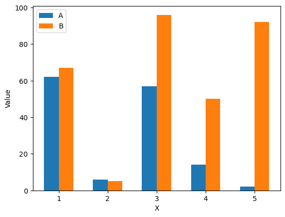
To summarize the code, the width is manually set, then based of the width we use a simple calculation to center the bars around the point. So since we have two categories, to center we need to subtracted half the width from the left column and add half the width to the right. Note that you may need to tinker with the width value to get the optimal spacing/appearance of the bars.
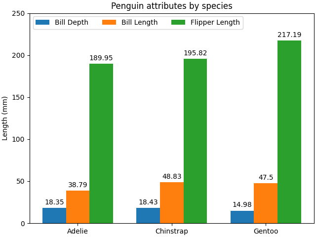
Bar Plot with Categories on X
A slightly more advanced plot has categories in the X axis. The example borrowed from the official documentation.
 1
 2
 3
 4
 5
 6
 7
 8
 9
10
11
12
13
14
15
16
17
18
19
20
21
22
23
24
25
26
27
28
29
30
31
32
33
|
# this example is from https://matplotlib.org/stable/gallery/lines_bars_and_markers/barchart.html
# data from https://allisonhorst.github.io/palmerpenguins/

import matplotlib.pyplot as plt
import numpy as np

species = ("Adelie", "Chinstrap", "Gentoo")
penguin_means = {
    'Bill Depth': (18.35, 18.43, 14.98),
    'Bill Length': (38.79, 48.83, 47.50),
    'Flipper Length': (189.95, 195.82, 217.19),
}

x = np.arange(len(species))  # the label locations
width = 0.25  # the width of the bars
multiplier = 0

fig, ax = plt.subplots(layout='constrained')

for attribute, measurement in penguin_means.items():
    offset = width * multiplier
    rects = ax.bar(x + offset, measurement, width, label=attribute)
    ax.bar_label(rects, padding=3)
    multiplier += 1

# Add some text for labels, title and custom x-axis tick labels, etc.
ax.set_ylabel('Length (mm)')
ax.set_title('Penguin attributes by species')
ax.set_xticks(x + width, species)
ax.legend(loc='upper left', ncols=3)
ax.set_ylim(0, 250)

plt.show()
|
Grouped Bar Plot with Time Series
The main complication that occurs with dealing with time series compared to the simple plot is the time series datatype itself. In simple plot, we could just subtract the width from the x series, this time around we need to convert the width to a timedelta, which only then can be subtracted from out x (time) series.
 1
 2
 3
 4
 5
 6
 7
 8
 9
10
11
12
13
14
15
16
17
18
19
|
import pandas as pd
import matplotlib.pyplot as plt
import numpy as np
from datetime import timedelta

df = pd.DataFrame()
df['Date'] = pd.date_range("2023-04-01", periods=5, freq="M")
df['A'] = np.random.randint(0,100,size=5)
df['B'] = np.random.randint(0,100,size=5)

width = 9  # Note that this is now a unit of time
plt.bar(df['Date']-timedelta(days=width/2), df['A'], width=width, label='A')
plt.bar(df['Date']+timedelta(days=width/2), df['B'], width=width, label='B')
plt.legend()

plt.xlabel('Date')
plt.ylabel('Value')

plt.show()
|
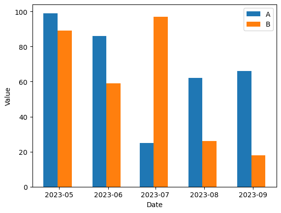
You can see we used days when creating the timedelta object. For the most part this will work and the width can be adjusted as needed, but when more resolution is needed seconds could be used instead.